|
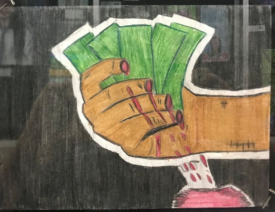
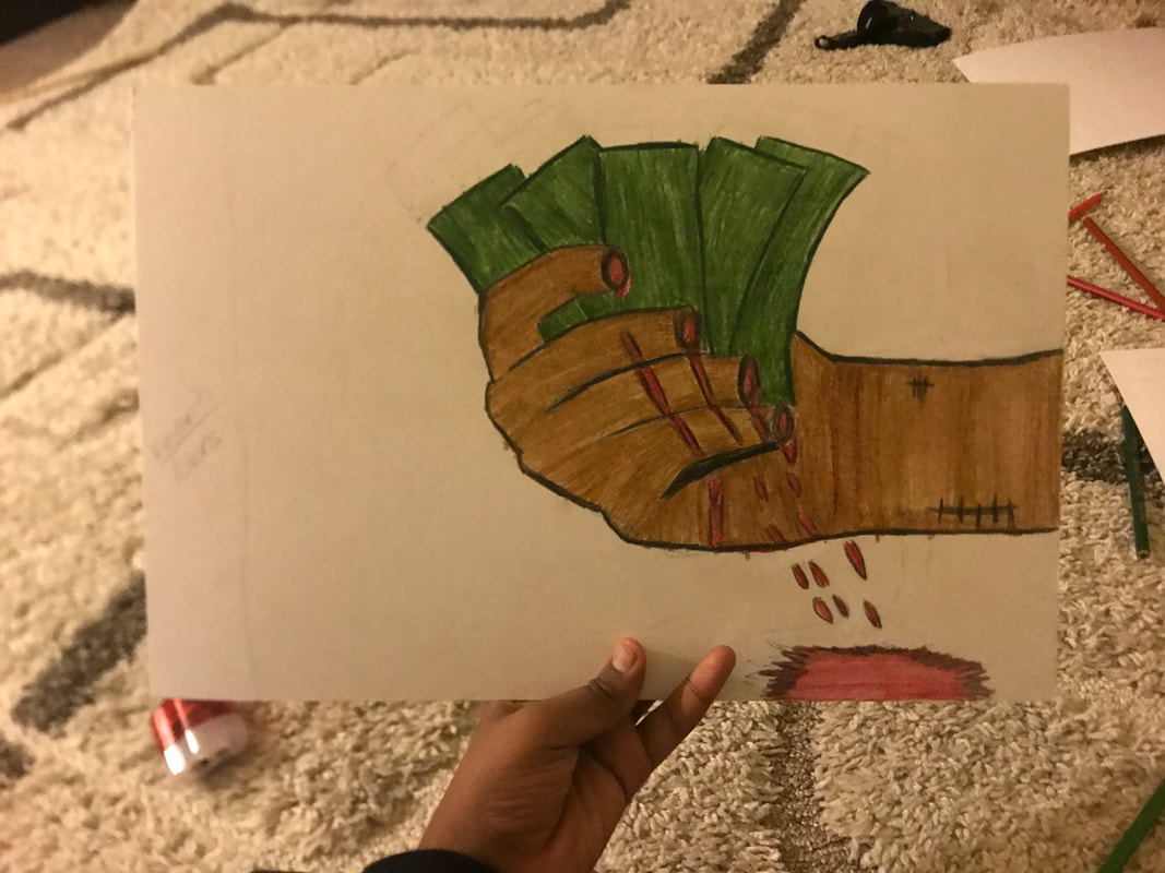
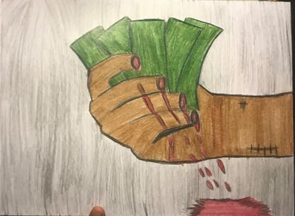
Cash for Cuts
|
&
|
Cash for Play
|
|

|
2 34 cm* 25 cm
Color Pencil on 2 Illustration Boards
Oct 2019
Color Pencil on 2 Illustration Boards
Oct 2019
Exhibition Text:
Cash for Cuts and Cash for Play are the continuation of my response towards the hard work my mom does. Influenced by my frustration over from hearing over the pain my mom feels every day at work, along with the realization there are people who playful waste money equivalent to works hard for. This piece is primarily inspired by Frida Kahlo's color scheme and Self Portrait with Necklace of Thorn and Hummingbird and Lichtenstein's Finger Point. Medium are Blick's Color Pencils on Illustration Board.
Critical Investigation

Frida Kahlo, Self-Portrait with necklace of thorns and Hummingbird , 1940. Oil on Canvas.
|
My main inspiration for this piece is Frida Kahlo's Self Portrait with necklace of thorns and Hummingbird. The connection to Frida's reaction to her suffering leaves me was what truly inspired me to make a piece conveying this message. According to Andreja Velimirovic (2018), "Every element in this painting gives specific clues to Kahlo’s mental state, perhaps none more than her still, direct, emotionless gaze that seems to express the immediacy of her pain." I appreciated and replicated her color scheme onto my piece, more specifically, the natural orangish-brown, red blood on the neck, black and green. I also appreciate Kahlo's use of dripping blood, an aspect I replicated onto my own piece. The blood dripping added the aspect of gore into her piece, something I knew that I wanted into my piece. The piece's nature them alluded to home, a reference to my mom.
|
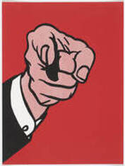
Lichtenstein, Roy, “Finger Pointing” 1973, screenprint.
|
Another inspiration for this piece is Roy Lichtenstein's Happy Tears. The piece's use of a dramatic facial expression was an aspect I wanted to incorporate into my pieces. Created during the Pop art movement, according to Stamberg (2012), "Lichtenstein's 1960s works were comic-inspired — they're angsty frames, often featuring ladies in distress. " An aspect that managed to mimic into my piece was the exaggerate facial expressions. Although in the movement, Color is the element often emphasized in his pieces, what drew me into Lichtenstein's piece was the subject's lack of text to explain her expression. I love Lichtenstein's use of black outline onto his figure, an aspect I wanted to replicate onto my own piece. The black outline draws viewers to the disciplinarian hand specifically, something I wanted to replicate. The single color background was also another aspect I appreciated. The rich color draws the viewer's eyes to the hand.
Overall, the two pieces helped me formulate ideas for the sketches. |
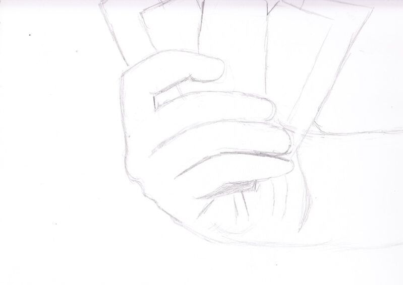
Sketches
|
|
|
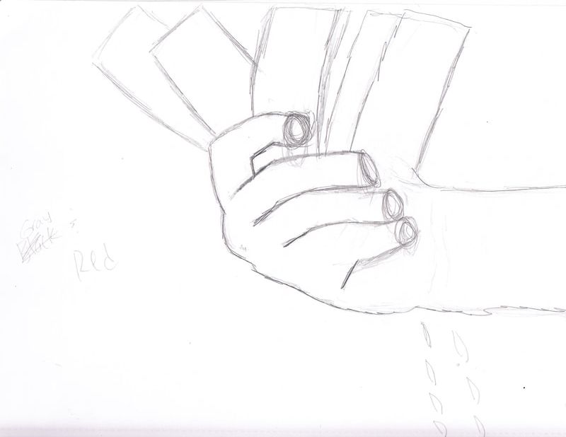
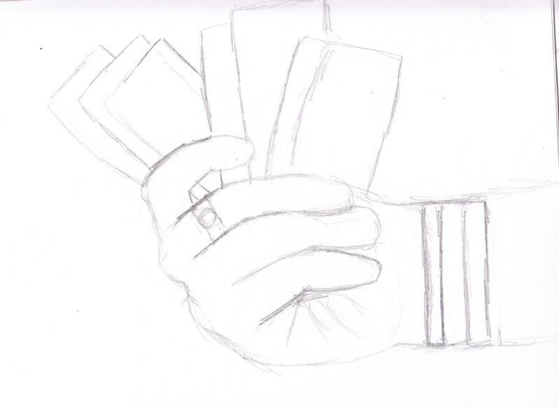
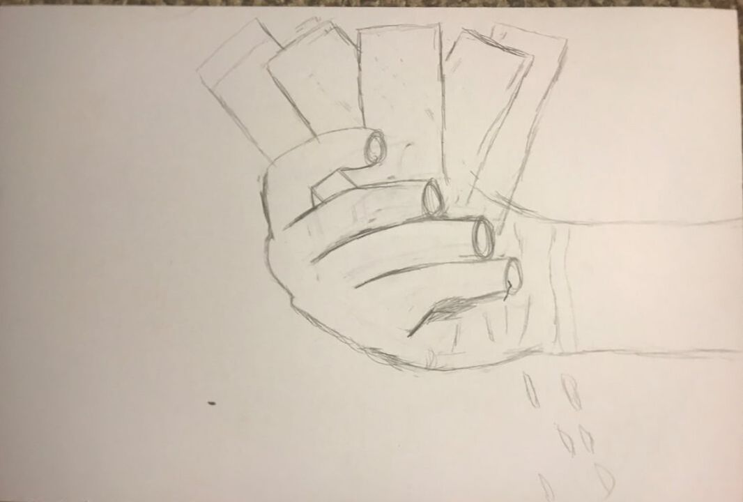
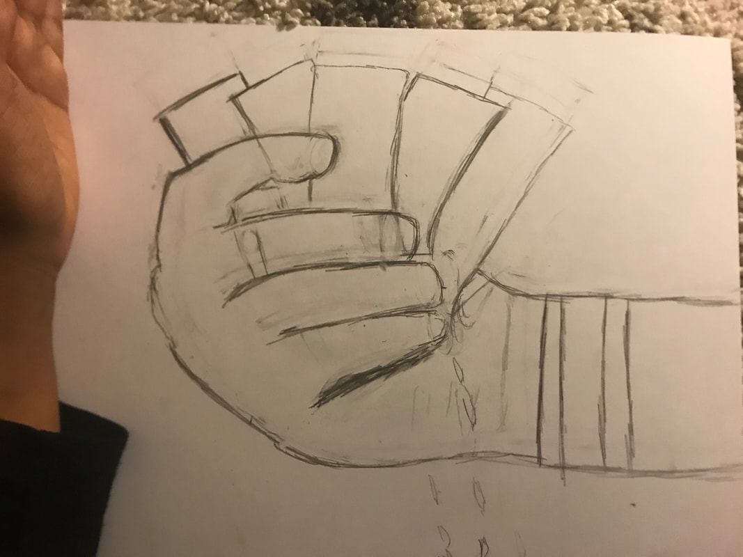
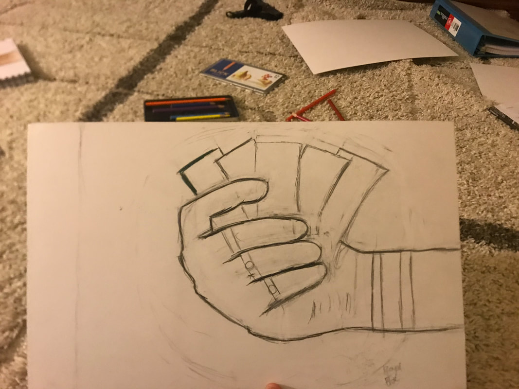
For this project, I originally wanted to do only one hand, however, after noticing how small that would be, I later realized that I should do otherwise. At first, I only wanted to use sketch one only, however, after going rogue in sketch two, I thought otherwise. While sketching, I wanted to use the hand so I did so. In first two sketches, I struggled with sketching the money, an aspect I fixed in sketch three. Other than the money, I really like sketch 1 the most because it seem to be the capture the most gore, however I knew I would eventually have to fix the money. I like sketch two more than sketch three as it capture the greed aspect the most against the bare hand. It was that sketch that convinced me to work it.
Process, Ideas, and Intentions
Experimentation with Reference Photos
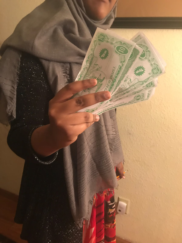
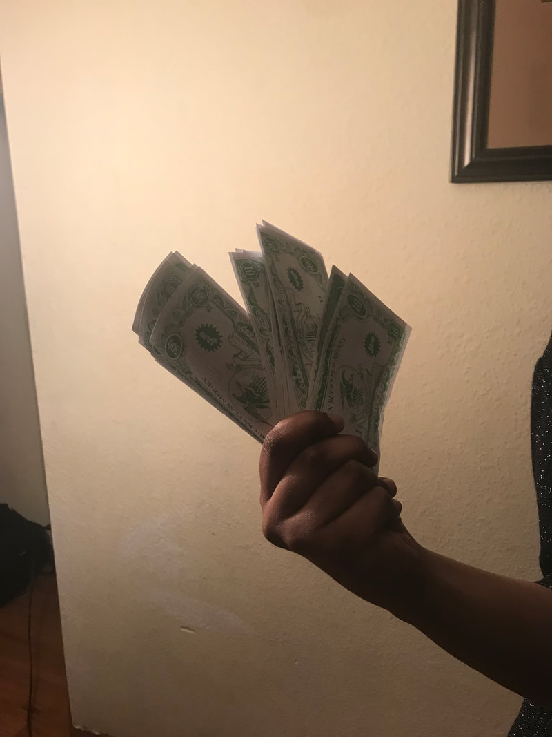
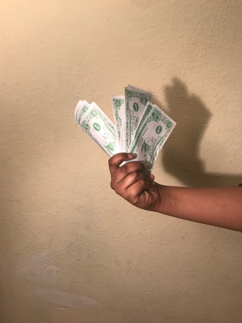
|
|
|
For this project, I knew that I need reference photos, mainly for the hand. For this project, I mainly played around with the light, and the position of the fingers. I did not like photo #1 because I was in the shit. I did not like #2 because how the cash was not facing the viewer and how the image was dark. In the photo #3, I appreciated how the photo was bright enough for me to distinguish the shadows of the hand, and how the hand look.
Experimentation with Colored Pencil
|
|
|
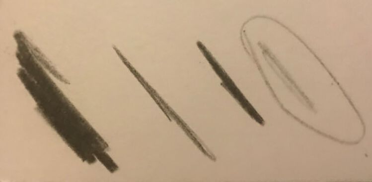
Since the medium I wanted to use were color pencils, I wanted to experiment using it on skintone. BLICK Studio color pencils contain 12 different colors and I initially was unsure of the ones I wanted to use. There were two different browns, Brown and Indian Red, both of which would coindie with my mother's hands. I though that the pencils blended well, but apparently that was not the case. I experimented the pencils on the my sketches, as they were almost the best subject for my piece. I learned the I wanted to color DARKLY. In general, the I could not use more than that. For the money, I learned that one main lighter green Grass Green should be used in the inside and a darker green Dark Green should be used on the outside. I also need to outline each hand DARKLY black colored pencil. I did not like the Indian Brown, something I later stop using and replace with Brown.
Process
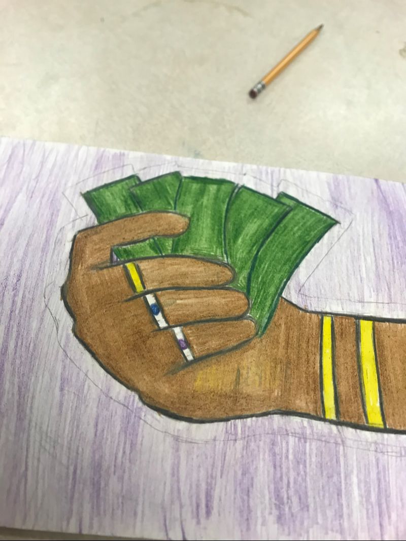
Cash for Cuts
|
|
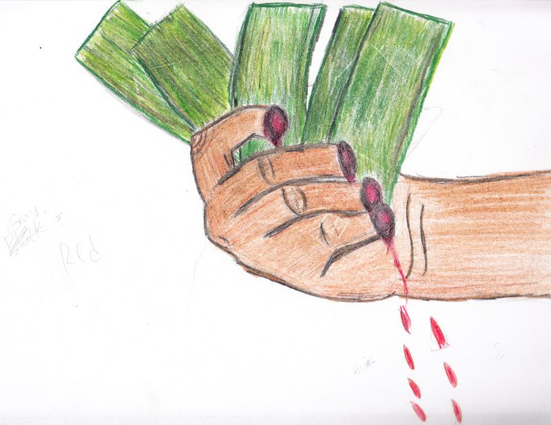
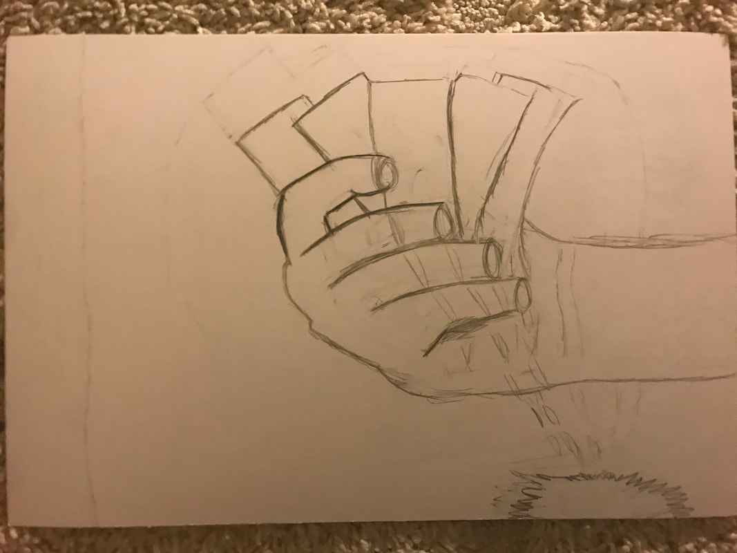
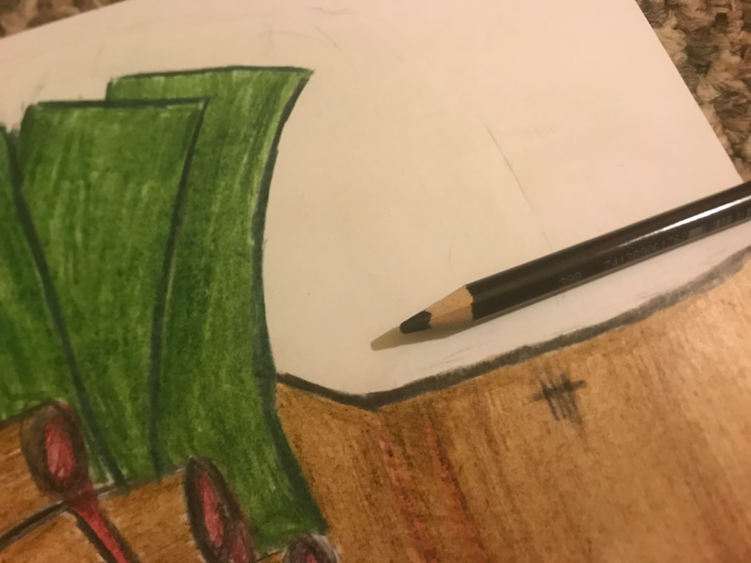
I began to sketch my first piece onto the board. I mimicked the money from sketch 3 and I enjoyed how it looked in the sketch book. I made sure to be careful with place it so that it would be as nice as it did in sketch 3. I mimicked the money drawn and added a blood splatter. I think it the almost cartoon drawing made this look a lot like Lichtenstein's piece.
|
|
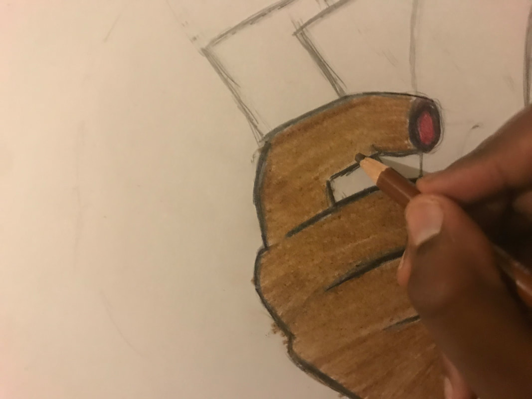
After sketching the image, I then used the color pencil Black to mimic the outline in the Finger Pointing piece. I also decided that I wanted to color in the hand. So with Brown from before, I darkly colored the hand in. I also used the Carmine red to color in the amputated fingers. I also made sure to leave space for the blood to flow out of the hand as they seemed important in the piece.
|
|
|
|
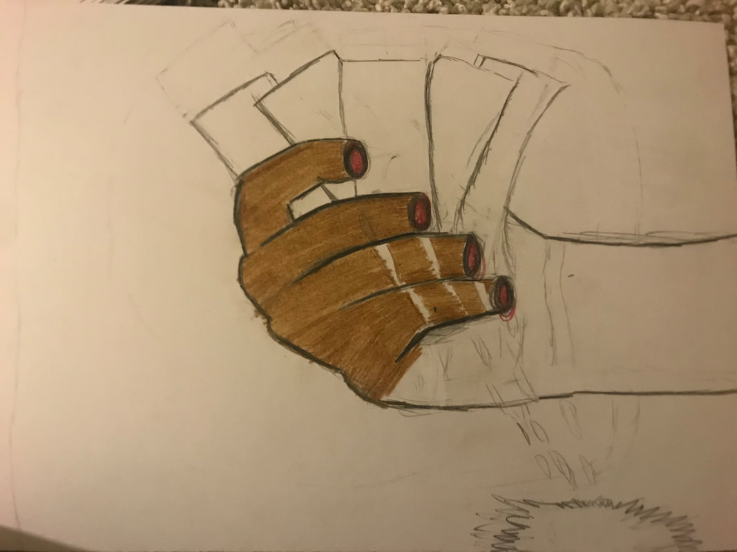
While I was coloring in the hand, I liked how the blood was flowing out of the hands. AS I was coloring in the hand, I later decided to add in some of the stitches from earlier. While I was doing that, I made the colored the oulining of the money with Dark Green and DARKLY coloring in the money with Light Green.
|
|
|
Experimentation with Colored Pencil (repeated)
|
I wanted to play around the background with the color pencil. I want to see how it felt to use the Black in the background. I play around with the pencil a bit and later decided that it would be easiest for me to use the lightest shade on the right for the background.For that color, I had to barely touch the board I play around on.
|
|
|
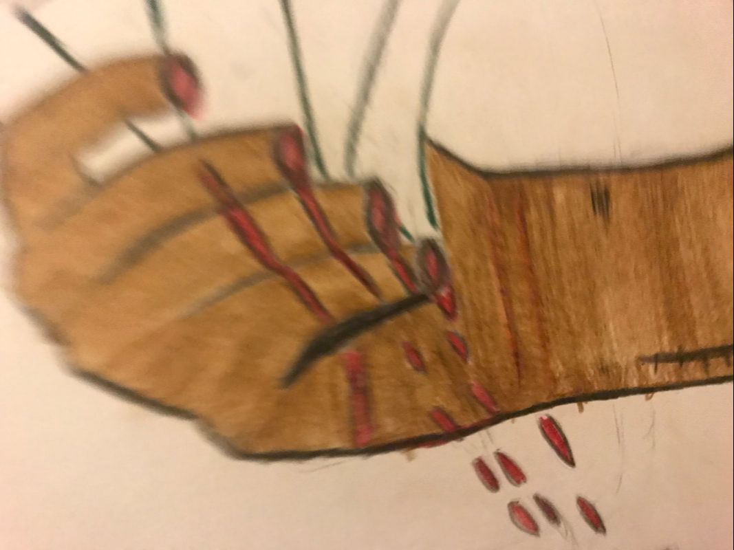
After finish the hand and the blood puddle, outlining it with Black and coloring it in lightly with Carmine red I lightly colored the background making hand movements, I colored in the background lightly using wide hand movements to avoid going too dark with the Black. I became wary of as I noticed that they were very prominent white streaks present in the background, something that would interrupt the contrast in the piece.
|
|
After looking at the background for a while, it seemed impossible for me to stop here. The background did not pop like it did in Finger Pointing. I feared that making it too black would draw the attention away from the hand. So as a solution I though about keeping the background a little grey. I decided to make a one centimeter long centimeter around the hand. I wanted to keep some grey so that it was there, however I want to stay consistent with Lichtenstein's piece. I then decided to repeat the dark method for coloring in the hand as I did at first with the hand, but I made sure to color around the hand darkly with the black color pencil.
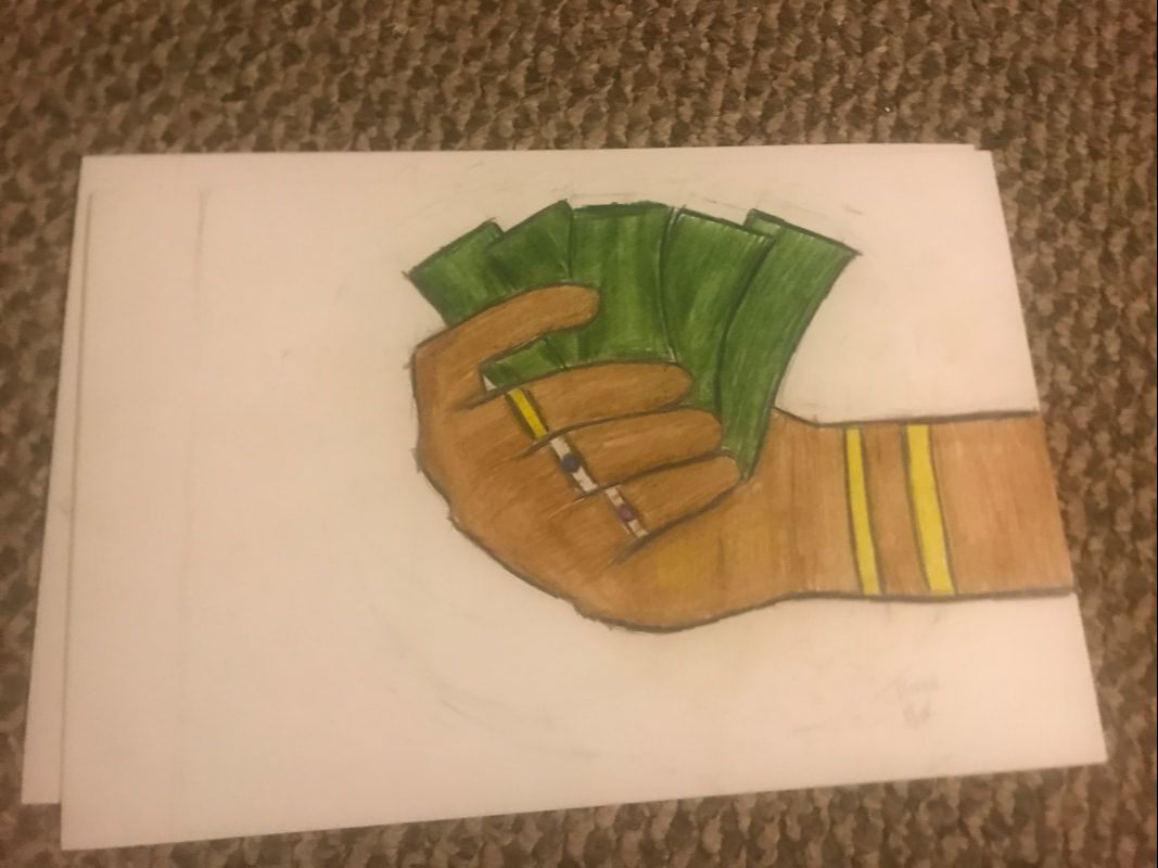
Final Product #1

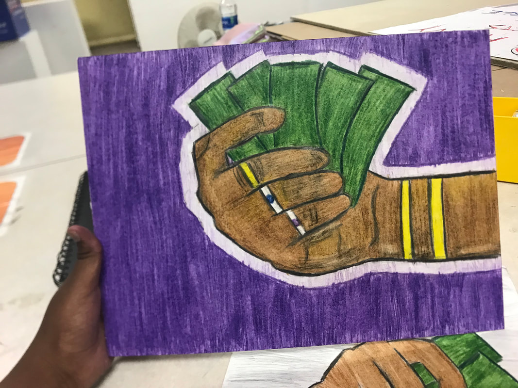
Cash for Play
|
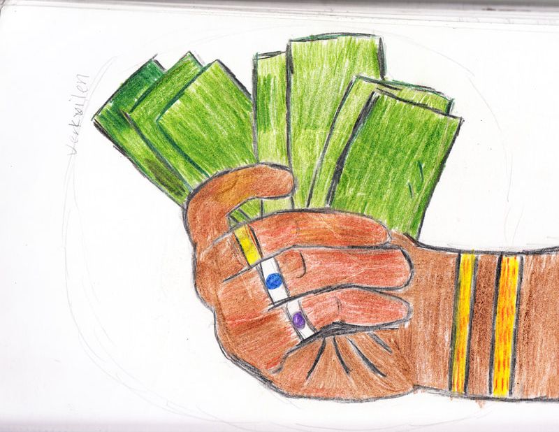
Here I repeated what I did in the first hand, but in here I repeated the rich piece. I made sure to add some aspect
I modify the hand so that it would resemble the reference photo better. I then made sure to draw some more additions like gold wrist bands and the jewelry sketched onto the board. |
|
|
|
After I outline the hand Black, I repeated the process of coloring in the money, ouline Dark Green and color in Grass Green. I then colored in the bracelets as yellow, opting out of the Orange seen in the experimentation. I repeat the light color background, but now, I used the Violet, a color I chose over the
|
|
|
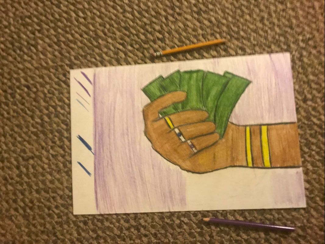
In the background lightly with the Violet, I then repeated the technique of a dark background onto of a light purple. I experiment with the Dark Blue before settling on the Violet, because the purple resembled the royal, while the blue resembled seemed to intense.
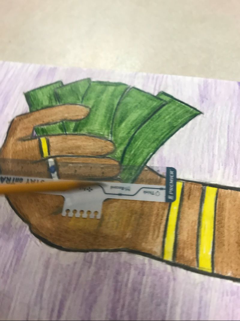
I then used a ruler to create the one centimeter boarder around the hand I recreated the one centimeter long border around the hand as an effort to make the hand look better. While I colored the background, I often found myself taking breaks to color in the hand again with the Brown, an aspect I repeated for the other illustration as well. |
|
|
|
After outlining the one centimeter outline of the hand, I then darkly colored the outside the Violet. I like how the background looked afterwards, as I think having the up and down motion with the coloring inadvertently added texture that looked nice at the end.
|
|
|
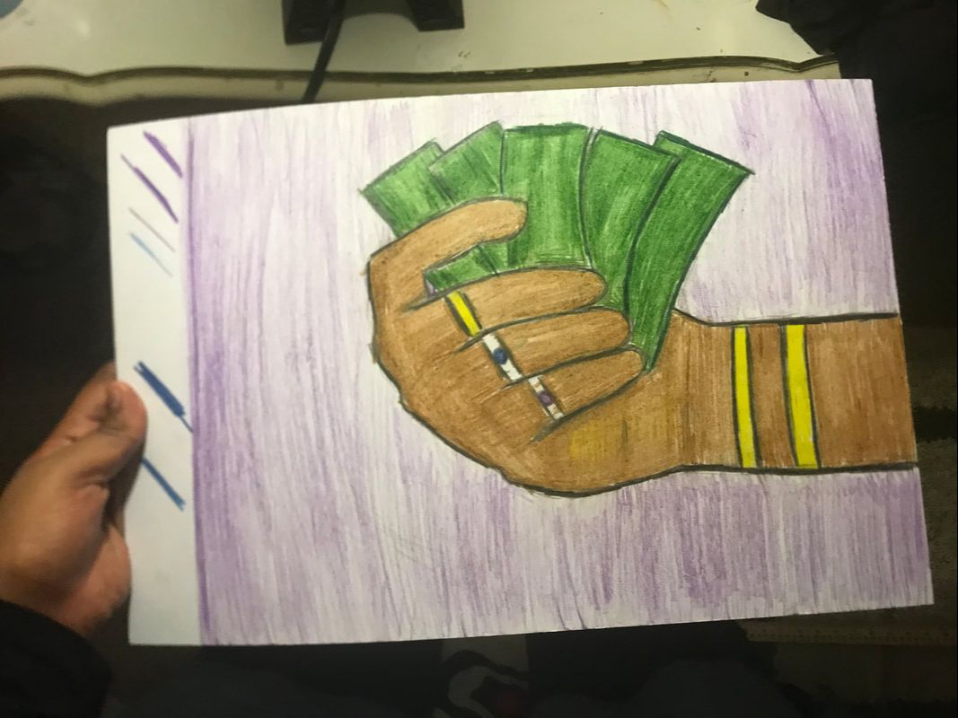
Final Product
Reflection & Critique
|
Compare
|
Contrast
|
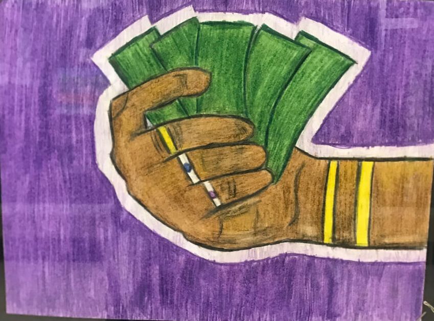
Cash for Cuts & Cash for Play
|
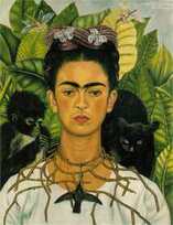
Frida Kahlo, Self-Portrait with necklace of thorns and Hummingbird , 1940. Oil on Canvas.
|
Cash for Cuts & Cash for Play
|

Lichtenstein, Roy, “Finger Pointing” 1973, screenprint.
|
Reflection
When creating this piece, I was primarily inspired by Kahlo and my Block print. After doing some research on Kahlo, I thought I should play around with her works. Compared to my previous illustration, I can definitely say that there was an improvement of the quality of my work. Using Blick's Color Pencil was much more easier to use and a lot less messy than the Gouache. This improved the quality of my craftsmanship. In general, I am content on how my piece turned out but, however, I do regret how the blood spill looks awkward. After comparing the pieces, I do believe I did better when it came to the background, as coloring it in deeply not only added the fully colored in background, a direct connection to Lichtenstein. My color scheme is very similar to that of Kahlo, as with some exceptions on my part, I mimicked many of her natural colors onto my piece. The use of black lines did create texture like Lichtenstein's piece. Some successes I had with this project is that I manage to improve the illustration skills. Rarely have I colored incorrectly. After accidentally getting some Black color pencil onto the rich hand, blending it with the Brown which caused the hand to look dirty under the richness, something I do not regret. Upon further reflection, I can visibly see how borrowing elements like color from both pieces. Adding vibrant colors added emphasis to the the hands its imperfection. Overall, I believe this piece was a piece well-done.
ACT Response Questions
Clearly explain how you are able to identify the cause effect relationship between your inspiration and its effect on your artwork?
Kahlo's use of natural colors and her use of negative connotations associated with black was something I replicated onto my own piece.
What is the overall approach the author has regarding the topic of your inspiration?
The authors approached the topic in informative way, providing enough context behind Lichtenstein's and Kahlo's pieces.
What kind of generalizations and conclusions have you discovered about people, ideas, culture, etc. while you researched your inspiration?
I discovered that when people observe work from Frida Kahlo, they see a piece full with symbolism. While Lichtenstein's observers seemed to relish his style.
What is the central idea or theme around your inspirational research?
The central theme around my research was to find a artist that express disappointment through a frailty symbol and how internal greed causes this.
What kind of inferences did you make while reading your research?
Throughout my research I inferred that Kahlo created pieces that referenced her view of the world, while Lichtenstein created pieces that seemed to mock melodrama
Bibliography
“Roy Lichtenstein. Finger Pointing from The New York Collection for Stockholm. 1973: MoMA.” The Museum of Modern Art, https://www.moma.org/collection/works/72057 .
Velimirović , Andreja. “The Importance of The Frida Kahlo Self-Portrait with Thorn Necklace and Hummingbird.” Widewalls, 2018, https://www.widewalls.ch/frida-kahlo-self-portrait-with-thorn-necklace-and-hummingbird/.
Velimirović , Andreja. “The Importance of The Frida Kahlo Self-Portrait with Thorn Necklace and Hummingbird.” Widewalls, 2018, https://www.widewalls.ch/frida-kahlo-self-portrait-with-thorn-necklace-and-hummingbird/.
