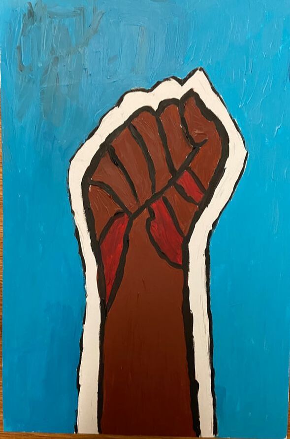
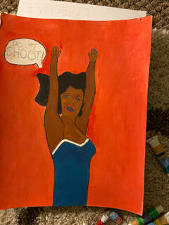
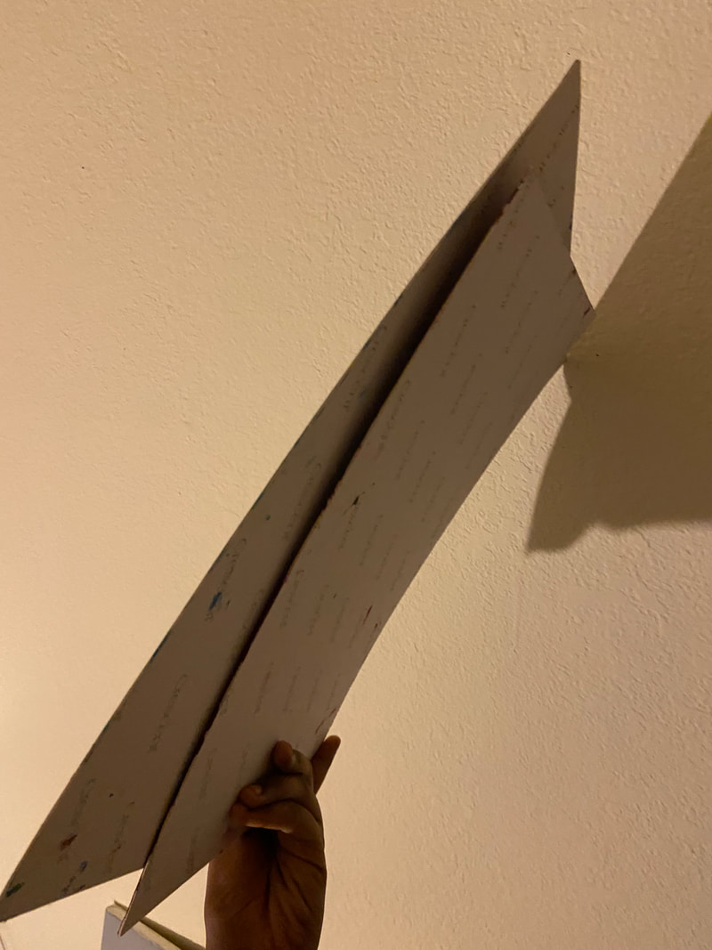
Dying and Reviving

|
31.75 cm *38.1 cm
Gouache Water Color Paint on 2 Illustration Boards
November 2019
Exhibition Text:
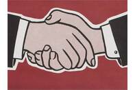
With store bought Gouche Paint on 2 Illustration Boards, Drying and Reviving reveals my agony around my home country and also the hope that is there. It is inspired by Roy Lichtenstein's use of intense color, black outline and white spaces, in his piece. Finger Pointing, and his Hand Shake. Through this, I also included cultural symbols like the Somali flag and the Black Power Raised Fist.
|
Critical Investigation
|
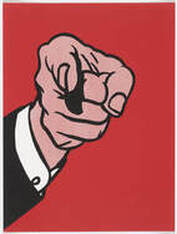
Roy Lichtenstein's Pieces
|
For this piece, my inspiration was Roy Lichtenstein. Knowing to have been active from the 1950s to the 1960s. According to Stamberg (2012), "Lichtenstein's 1960s works were comic-inspired — they're angsty frames, often featuring ladies in distress. " He emphasized on the dramatic features with melodramatic undertones. The colors used were solid, along with smooth, dark-colored outlines. For these particular pieces, I was inspired by Lichtenstein's use of hands in his art work, an aspect I repeated to my own pieces. Another aspect I was inspired by was the outlining of the piece. I plan on using the extra- white outline found in Lichtenstein's piece, "Handshake", as I appreciated how lines added emphasis to the pieces. I also plan on using black outlining into the pieces. The black lines look like the perfect divider against the bright colors, something I plan to include in my pieces.
|


Symbols
|
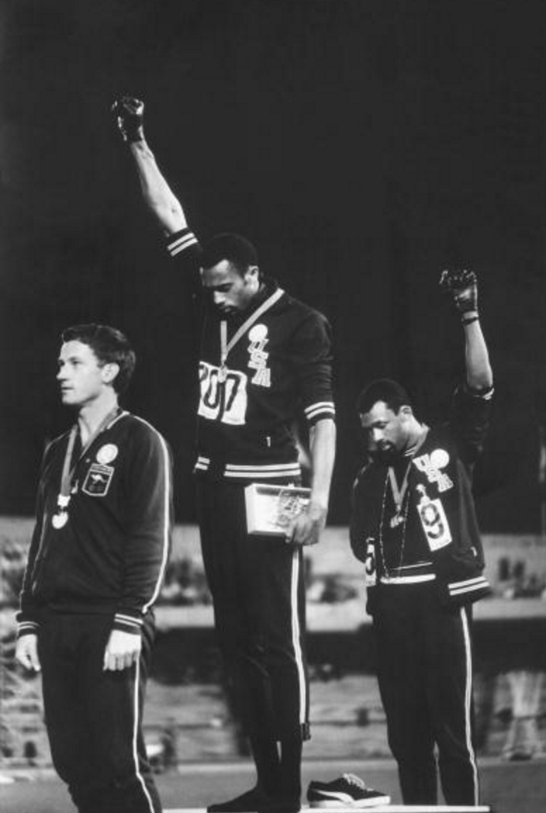
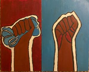
For this project, I was also inspired by two main symbols, the Somali flag and the Raised fist. The Somali Flag is the flag I attach with my identity and after hearing a lot about the apathy Somalis have about their culture even after a long, long civil war caused by nationalism, and the civil war. After learning about the Civil Rights and the Black Panther Party in the U.S., I became inspired by the fist representation of moving pass over the bigotry. In the photo of the right, BPP member once stated after raising their fists in the Olympics, "“We are black and we are proud of being black. " (Kohn). That inspired me to incorporate the fist into the pieces, as it encouraged me of thinking about a potential generation comeback after years and years deterioration. For this project, I wanted to project both the aspects: the deterioration and the reliving, in order to suggest that it was possible.
|

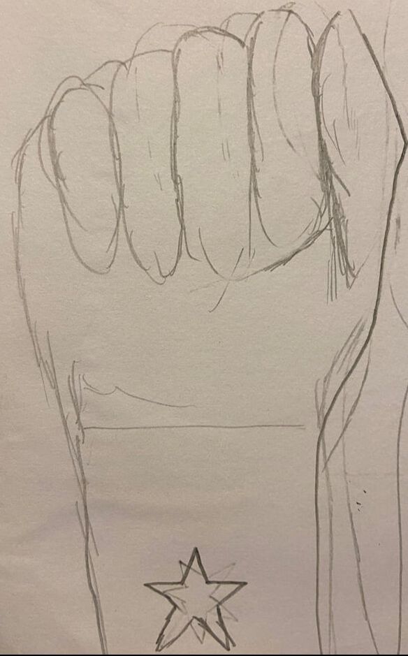
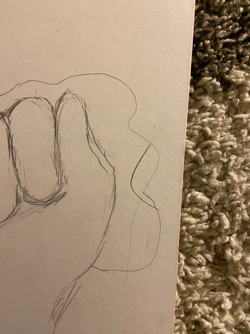
Planning Sketches
Dying S
|
|
|
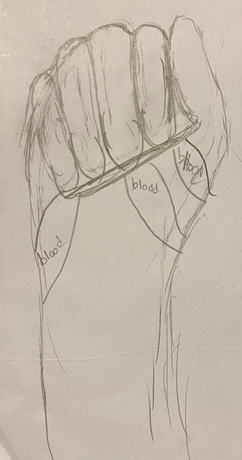
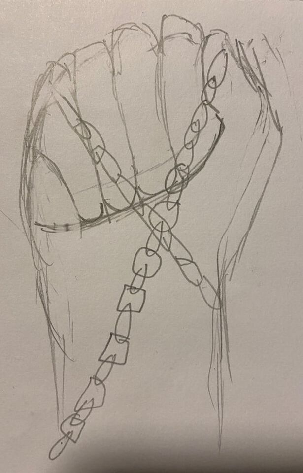
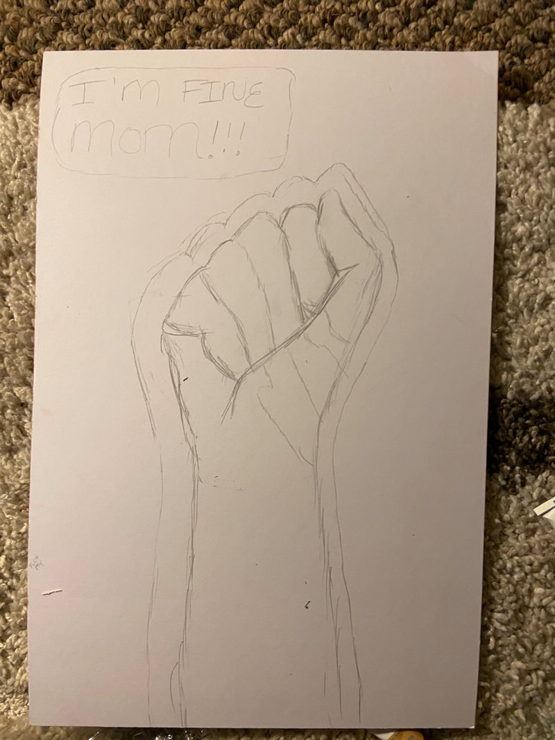
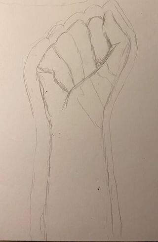
In the dying sketches, I wanted to focus on having the sad paint emphassied through the piece. Although I did find it hard to add nice chains seen in sketch 2, I feared that this would be hard to paint with gouache. I personally prefered the first piece as the three dripping lines of blood runnging dorn the hand looked better than that if sketch 3. It was because of this that I chose Sketch 1 for this illustration
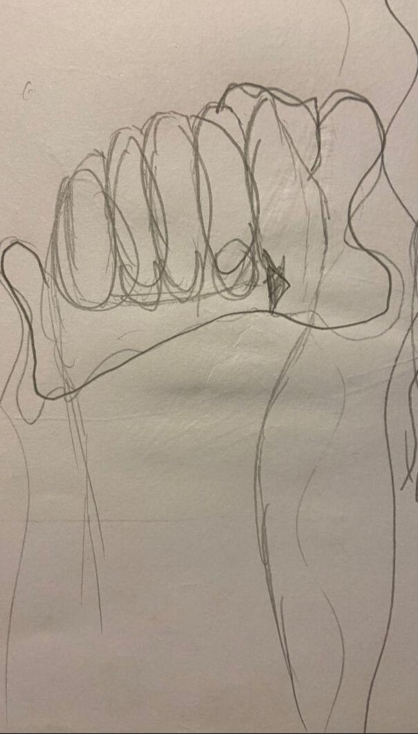
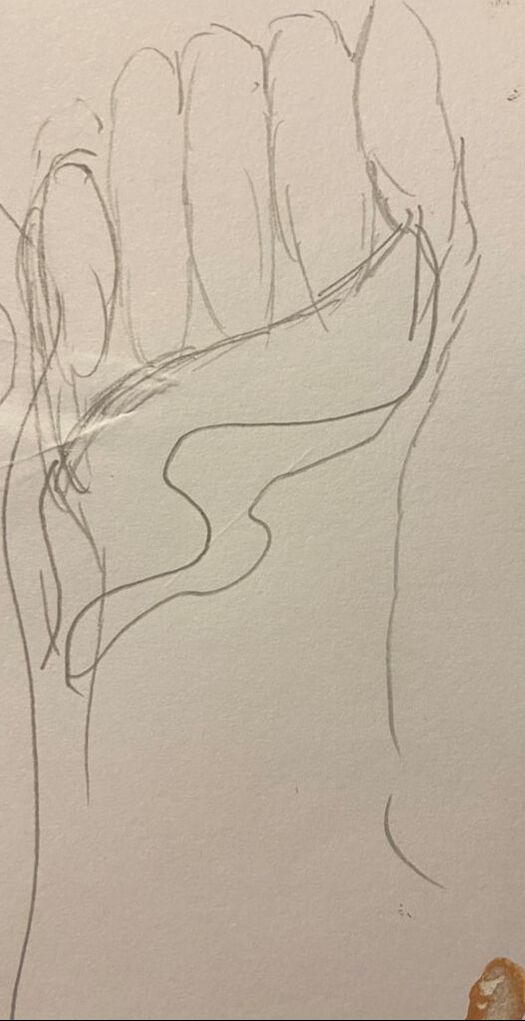
Reviving sketches
|
|
|
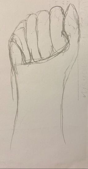
For this sketch, I knew I wanted to add the Somali flag into the hand, but I did not know how I was going to do it. In Sketch , I wanted to have a Somali Flag Drape down the hand, which I later realized look rather unnatural. In Sketch #3 I wanted to have the flag drape off the hand towards the left, which also relaly looked unrealistic. This is why I chose Sketch 2 for the hand as I found it easier to added the waving portion.
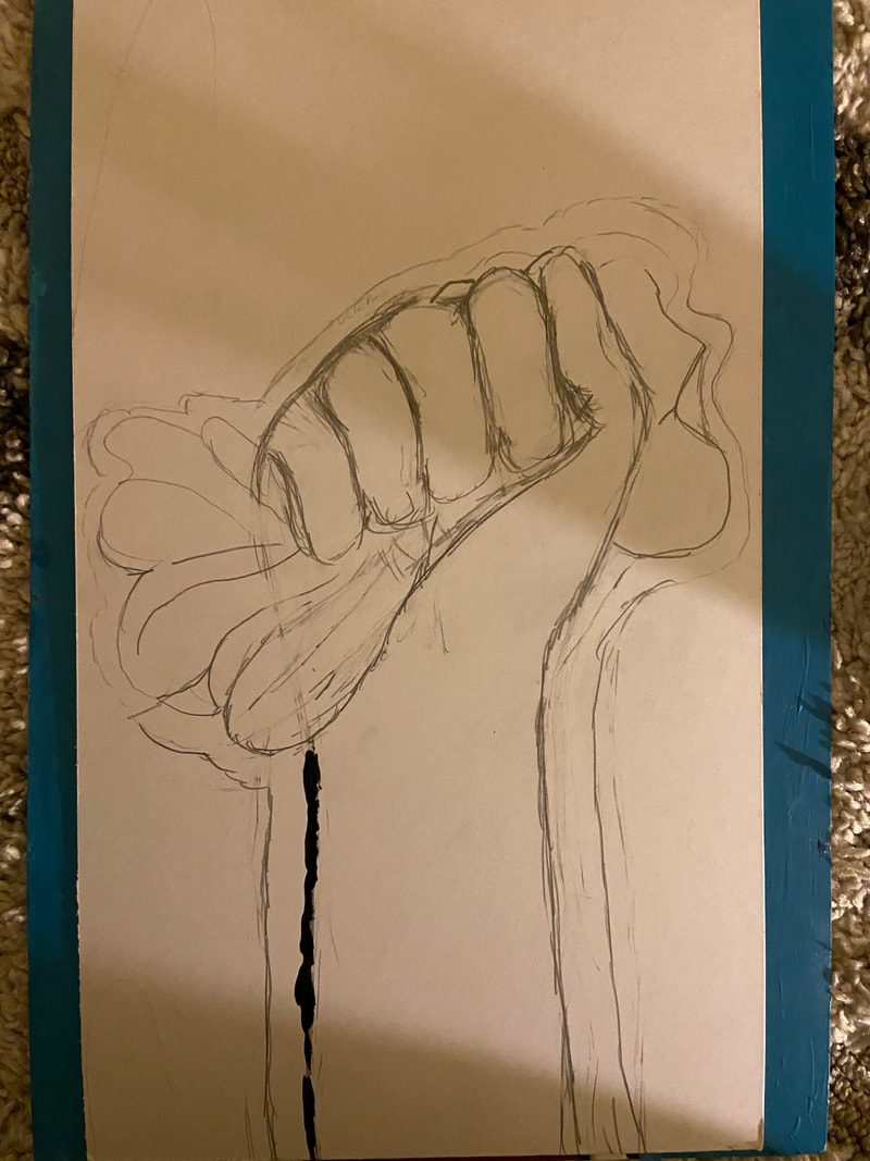
Process
Dying Piece
|

|
|
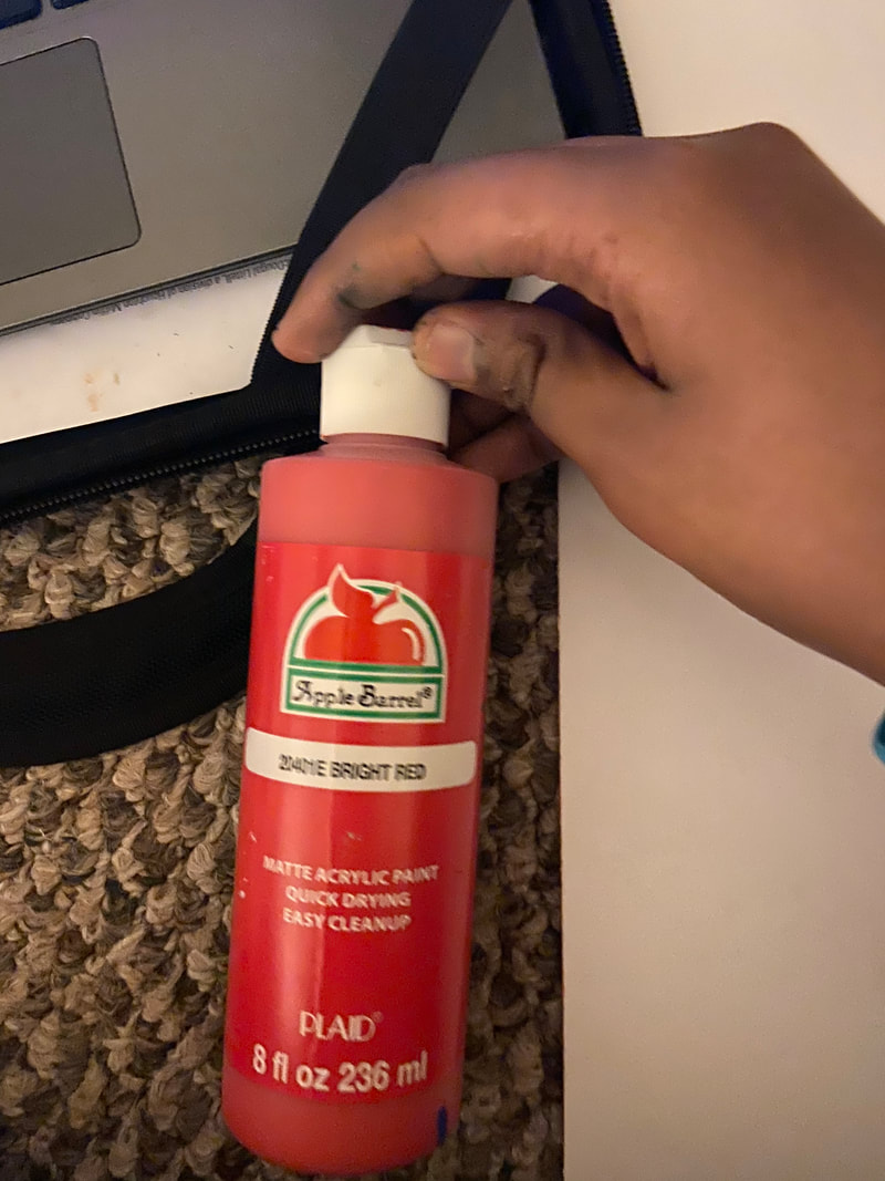
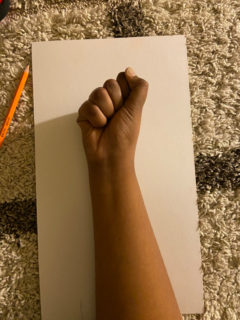
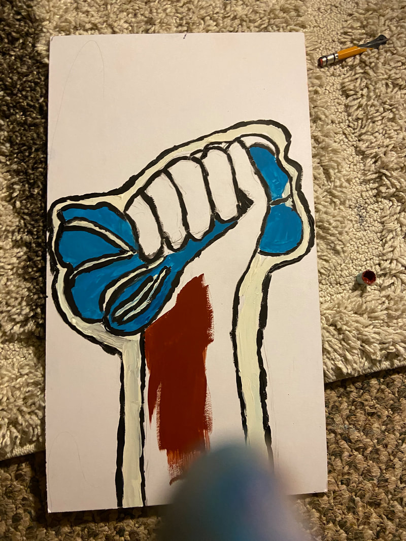
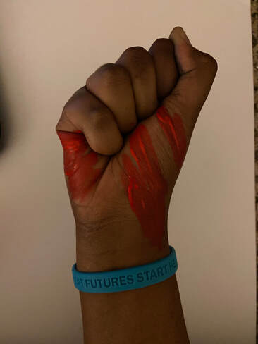
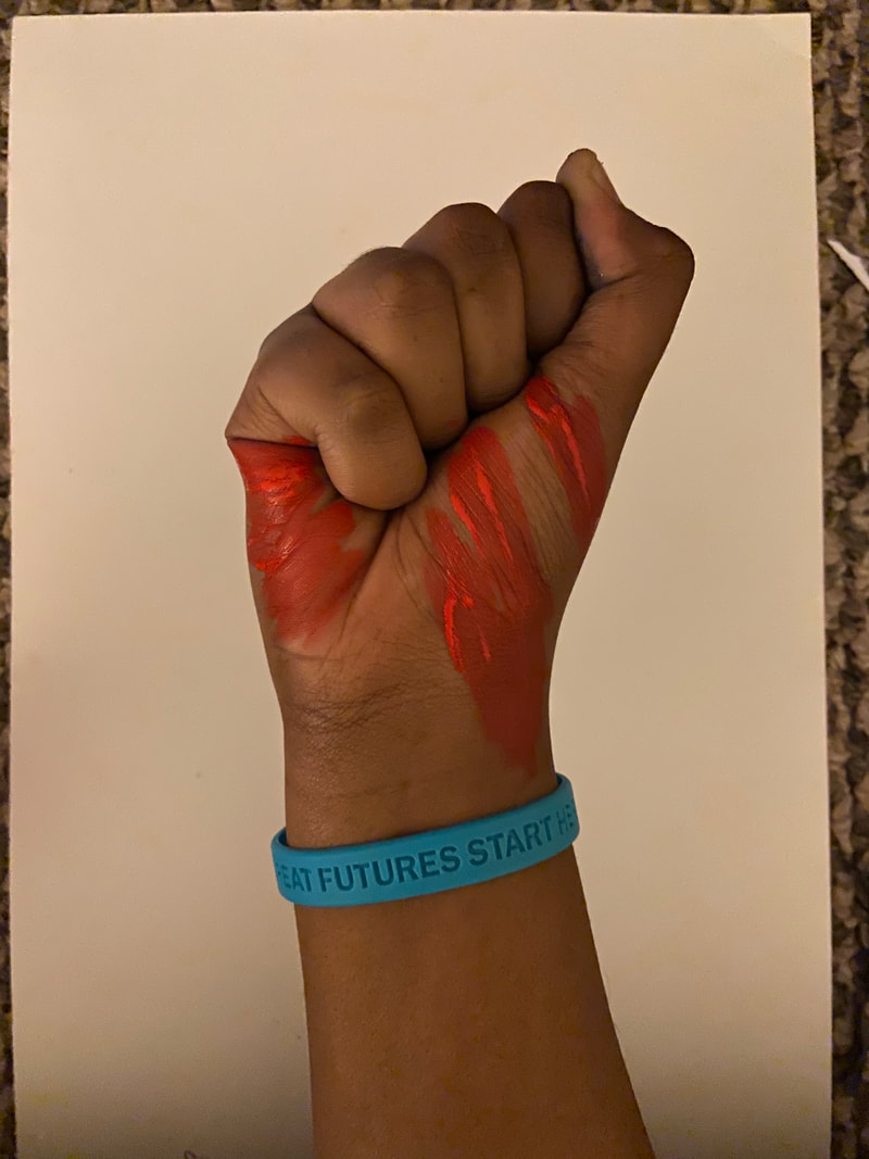
To begin, I wanted to use my actual hand as a reference photo. I also wanted to see how the blood looked, so U sed my Apple Barrell Bright Red Acrylic Paint and painted my hand to add blood lines. I then made a free hand sketch of that onto the illustration board. I made sure to leave white space so that my piece resembled that of Lichtensetin , adding the "pop art" element into my piece.
|
|
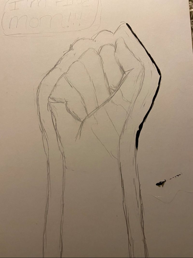
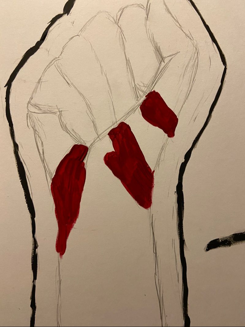
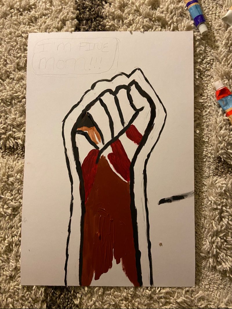
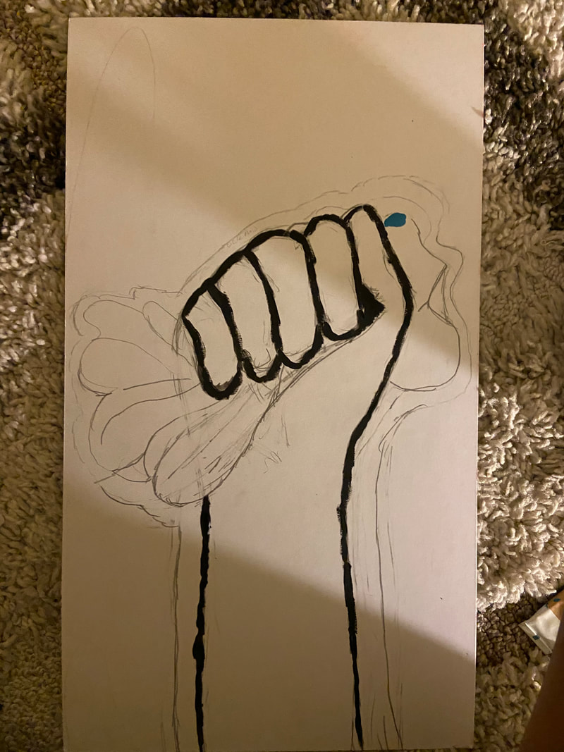
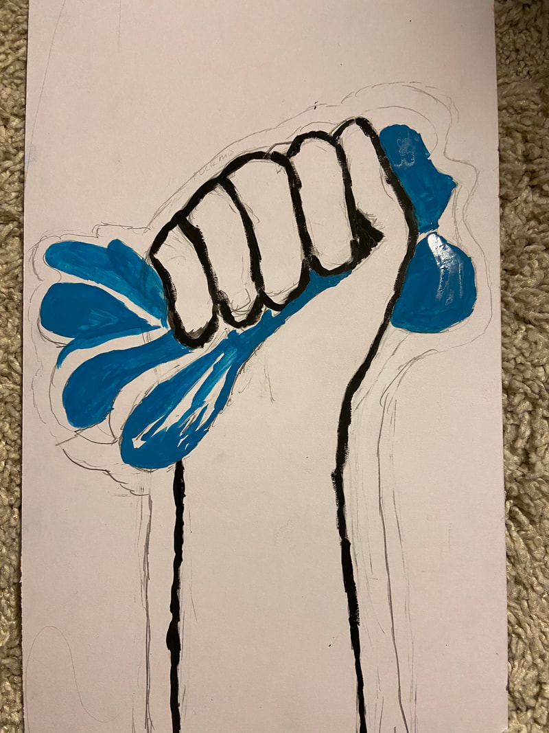
After I sketched out the hand, I began to paint. I began to outline the hand and the white space with my Artist's Loft Lamp Black Gouache Paint. I also used my vivid Crimson Red for the blood. I then use the Burnt Sienna to add the hand color. I accidentally split some extra paint onto the illustration and later waited for it to dry and then I fixed it.
|
|
|
|
|
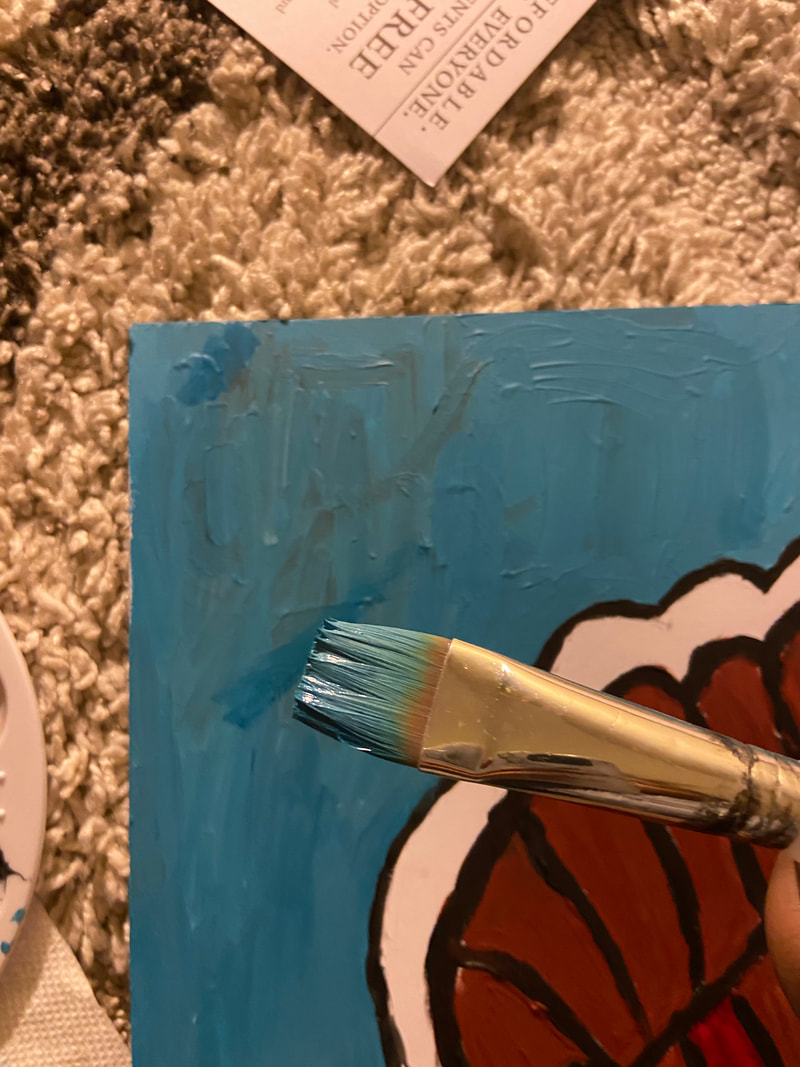
Here I then mixed Titanium White with Cerualean Blue to help create the light blue color resembling rthe Somali flag. I then began to use my 3/4"brush to broadly paint over the background. I also waited a few days to repaint the background so that it would be one solid color before I finished the piece.
|
|
|
|
Reviving
|
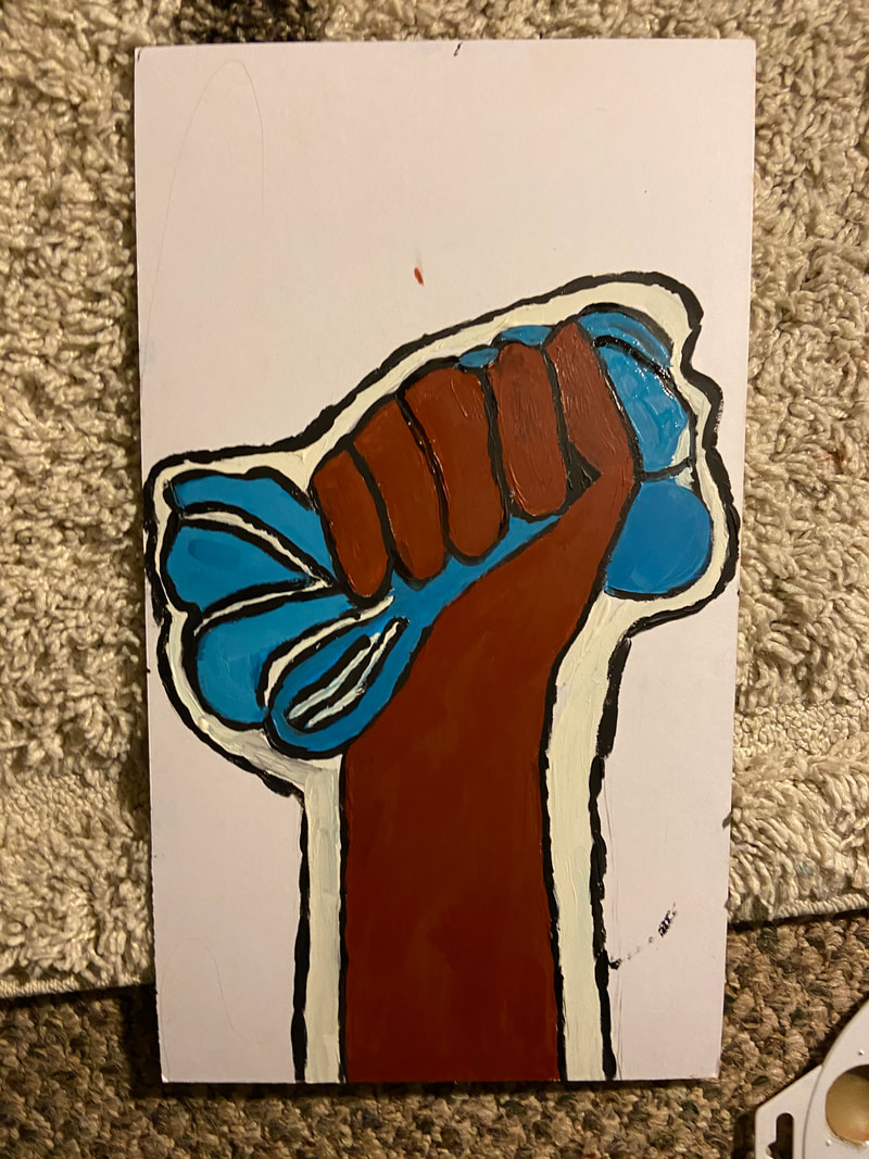
I then repeat process for the other hand. I took a reference photo of my hand, which I use to outline my hand. For this part, I used another reference photo (see experimentation) and I outlined the onto the board. From then used the Lamp Black paint again to outline the hand again.
|
|
|
|
|
|
|
After I outlined the hand again, I used a rather darker mixture of the Cerulean Blue and Titanium White to paint the Somali flag. I left some white space in the flag, so that I would added some black lines into the piece to make it seem more pop art-ish like Roy Lichtentein. I found the Titanium white, not as white as the board, making a a bet converned. I then used the Brunt Sienna for the skin ton, as I did earlier.
|
After I cleaned up the piece a bit, I then made sure that the paint was more solid. I then used the bloody dark Crimson Red and the thick 3/4" brush to made the paint more evenly distributed.
|
|
|
Final Product

Experimentation
Experimentation with Sketching without Grid Method
|
|
|
I experimented with the hands. For this project, this was the first time I success drew a hand without using the grid method an aspect that surprised me. I noticed that while I was sketch the hand out, I made to take breaks as I outline the hand further.
|
|
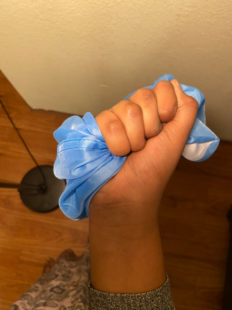
Also for this project, I experimented with the flag. I did not know how to sketch onto the canvas me holding the flag so I used the reference photo. I found that there were many ripples in the flag as I clenched it like this and I found that doing so made the piece look better, as aspect I enjoyed.
|
|
|
Experimentation with Gouache Paint
|
For this project, I knew that I had to be careful with the water color paint. Last year, with my previous illustration, I noticed that using too much water caused the board to curve upward, an aspect that made me nervous. For this piece, I made sure to be careful with and choose to be more careful with water. In fact, I used the paint straight from the container in most instances and that worked as I noticed that the two boards were flat compared to that previous illustration with gauche paint.
|
|
|
Reflection & Critique
Reflection
For this project, I focused on hope at a time where I felt the most apathy towards Somalia. I appreciated how the pieces resembled Lichtenstein's work as I saw the outlining and the bright vibrant colors for this piece. After completing this piece, I can definitely say that I felt a lot better and believe this piece convey a lot of what I felt about the word around me. The symbols I used in the piece looked amazing in the pop art style of the piece and I was so glad that the piece was not blend, ad not using too much water helped helped that problem I faced sketching. This piece looks a lot better than my previous painting illustration for sure. However, my greatest struggle in the piece was making the paint as SOLID as a possible. I noticed that especially with the Crimson Red paint, it was hard to make the background less solid. Even after adding layers after layer, it was hard to make the piece solid. On the bright side, I can definitely say that there was an improvement of the quality of my work and my favorite illustration. It was the best craftsmanship I had for an illustration. After comparing the pieces, I do believe I did better when it came to the background, as adding the white space added emphasis, to the piece a direct connection to Lichtenstein. My color values were similar to Lichtenstein as well, as we both used rich colors, unlike his dark colors. My use of blue, unlike Lichtenstein's dark black lines, did create texture like Lichtenstein's piece. Upon further reflection, I can visibly see how borrowing elements like color, texture and values from Lichtenstein. Overall, I believe this piece was a piece well-done.
Critique
|
Compare
|
Contrast
|

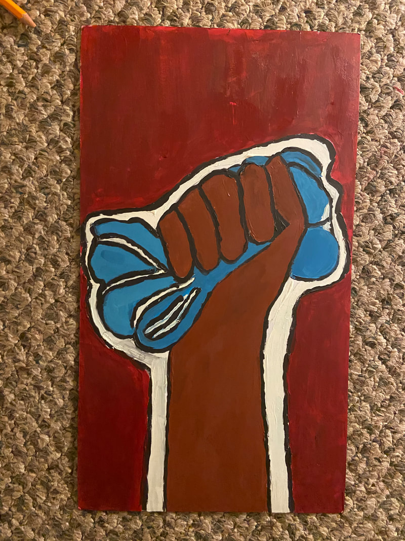
Dying and Reviving
Dying and Reviving
|
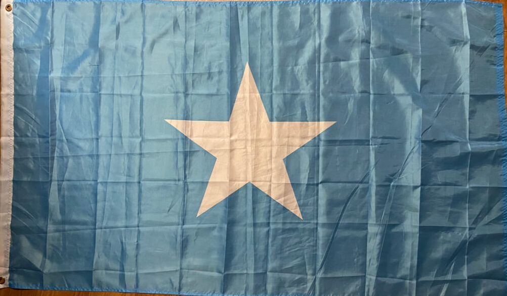
Somali Flag at my house
|
Connection to ACT
Clearly explain how you are able to identify the cause effect relationship between your inspiration and its effect on your artwork?
Lichtenstein's use of bright colors along with the fact that the Somali flag represented the Somali people inspired me to me to incorporate it into my piece.
What is the overall approach the author has regarding the topic of your inspiration?
The authors approached the topic in analytic way, while including inspirations each other had.
What kind of generalizations and conclusions have you discovered about people, ideas, culture, etc. while you researched your inspiration?
I noticed for both the clenched fist represented although the fight that was not done yet, the was unity among us, something that drew my eyes to the piece.
What is the central idea or theme around your inspirational research?
The central theme around my research was to find a artist that had a piece that represented overcoming a national struggle, while being visually appealing.
What kind of inferences did you make while reading your research?
Throughout my research I inferred that Lichtenstein created pieces that seemed to mock melodrama, the symbols represent the fight.
Bibliography Page
Cushing, Lincoln. “A Brief History of the ‘Clenched Fist’ Image.” Docs Populi, 2018, http://www.docspopuli.org/articles/Fist.html.
Kohn, Asher. “A Visual History of the Fist.” Medium, Timeline, 3 Feb. 2016, https://timeline.com/a-visual-history-of-the-fist-e0c4861f856a.
Kohn, Asher. “A Visual History of the Fist.” Medium, Timeline, 3 Feb. 2016, https://timeline.com/a-visual-history-of-the-fist-e0c4861f856a.
